The aim for the second part of the day was to go out and to take pictures of; fall, crush, jump, echo, sad and happy. The pictures had to be taken at the right angle/ frame, as it had to earn its place.
FALL
Both pictures were taken for the same idea of FALL, first one picture was taken of a fence from above to create an illusion of FALL, which i think came out pretty good. The second picture is more obvious of a brief, feet above as it is FALLING, the bright windows creating the illusion of a sky which makes the feet look like they are higher .
CRUSH
The first picture of CRUSH is a picture of a Coca Cola plastic bottle being Crushed and then edited on Photoshop to make it more interesting and dramatic, even though CRUSH is meant to come out as probably more of sad and angry colours, i have done the opposite by making it more colourful and bright to bring out the contrast and playfulness.
However the second photograph i have taken is more deeper of a word CRUSH, not as obvious as the first picture. My representation of CRUSH is the cigarette being smoked, how it has wrinkled with every time the girl inhales the smoke as it is a movement of CRUSH.
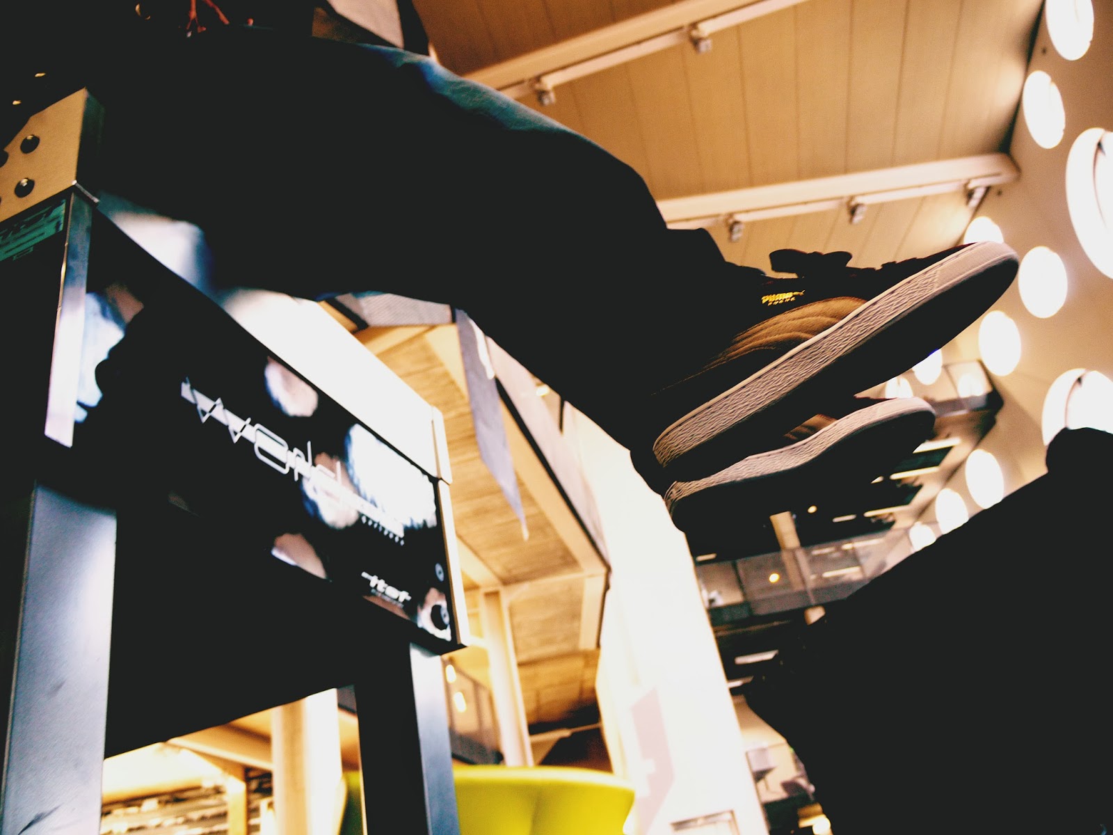
JUMP
This time the idea of JUMP is simple and straightforward. However the main focus is the JUMP in the shadow instead of a person JUMPING. Also the focus is on the feet and legs as those are caught in the moment.
ECHO
ECHO repetitive and endless.
SAD
The first photograph was taken at Ravensbourne university and as all of its windows are circle, it created the perfect shadow for this picture. SAD in this picture is created by the feeling of loneliness and depression, as it is such a dark picture and the idea of there only being one person in it and not being able to see the face or body also creates mystery.
The second photograph is a complete contrast to the first photograph as the colours are so different but still represent SADNESS. The main colours in the photograph are blue and green, colours that are thought of being used for SAD whenever a picture is drawn or photographed. Loads of contrast used to make it more expressive and stand out.
Last photograph is taken and focused of a manikin surrounded by others and having loads of needles in it representing being hurt and excluded from majority.
HAPPY
A cheeky little smile on my friend's face representing HAPPINESS, very simple and plain. I like the fact that it is such a close up as it creates more questions and mystery to the photograph.


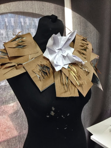
 After the 5 samples we were asked to recreate one of our chosen sample 20 times and i chose to recreate this, however it was much harder and in my opinion unsuccessful because i had to enlarge it and had to use brown paper which came out very rough and ugly.


 No brief,


 Unusual and crazy.
 Simple, minimalist.


